Core Concepts of Python for Analytics
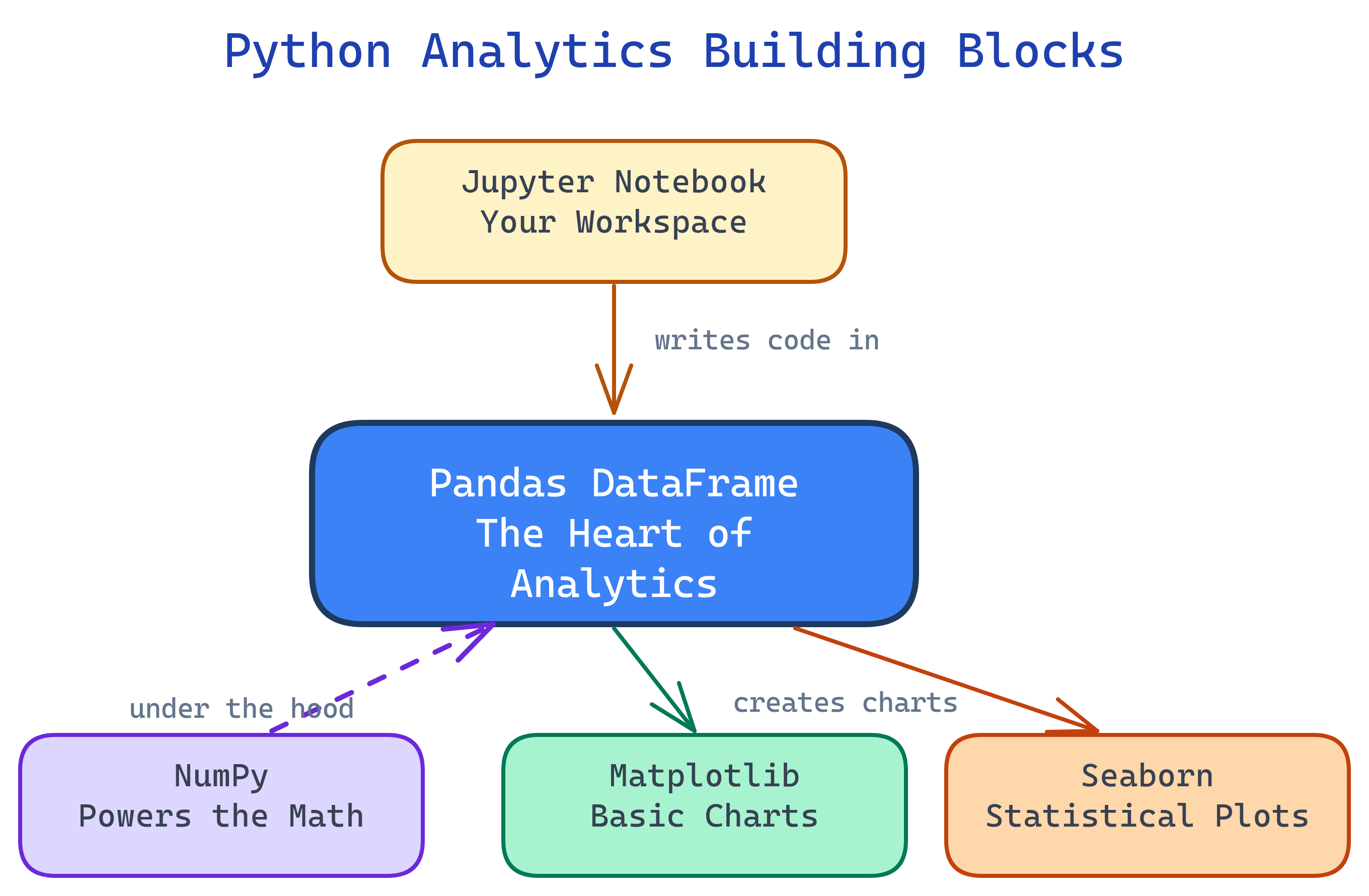
The Python analytics stack has 5 building blocks: Jupyter (workspace), NumPy (arrays/math), Pandas (DataFrames), Matplotlib (charts), and Seaborn (statistical plots). Everything revolves around the Pandas DataFrame.
The Big Picture
These five tools form a layered stack. Jupyter is the workspace, NumPy is the math engine, Pandas handles data, and Matplotlib/Seaborn turn it into visuals.
Explain Like I'm 12
Think of data analysis like cooking a meal. Jupyter is your kitchen — the place where everything happens. NumPy is your measuring cups and scales — precise math tools. Pandas is your cutting board where you chop, sort, and prepare ingredients (data). Matplotlib is how you plate the food — making it look presentable. And Seaborn is the garnish and plating style that makes it restaurant-quality with minimal effort.
Cheat Sheet
| Tool | Key Syntax | What It Does |
|---|---|---|
| Jupyter | Shift+Enter to run a cell |
Interactive workspace — code, output, and notes in one document |
| NumPy | np.array([1,2,3]) |
Fast arrays and vectorized math (mean, std, where) |
| Pandas | pd.read_csv("data.csv") |
Load, clean, filter, group, merge tabular data in DataFrames |
| Matplotlib | plt.bar(x, y) |
Charting foundation — full control over every visual element |
| Seaborn | sns.histplot(df["col"]) |
Statistical plots with built-in themes — one line for publication-quality charts |
The 5 Building Blocks
1. Jupyter Notebooks — Your Workspace
Jupyter is where you do all your analysis work. It runs in your browser and organizes your work into cells — each cell is either code (Python) or text (Markdown). Run a cell and the output appears right below it.
Why it matters: Jupyter lets you explore data interactively. You write a bit of code, see the result, tweak it, and keep going. No need to run an entire script from top to bottom — just run one cell at a time.
Key features:
- Code cells — Write and execute Python. Output (tables, charts, numbers) renders inline.
- Markdown cells — Add headings, explanations, links, and formatted notes alongside your code.
- Inline charts — Matplotlib and Seaborn plots render directly below the cell that creates them.
- Rich output — DataFrames display as formatted HTML tables with scrolling.
Essential keyboard shortcuts:
| Shortcut | What It Does |
|---|---|
Shift+Enter |
Run current cell and move to next |
Ctrl+Enter |
Run current cell and stay |
Esc then A |
Insert cell above |
Esc then B |
Insert cell below |
Esc then DD |
Delete current cell |
Esc then M |
Convert cell to Markdown |
# Install Jupyter (one time)
pip install jupyterlab

# Launch it
jupyter lab

# In a cell, type and press Shift+Enter:
print("Hello, analytics!")pip install jupyterlab and launch with jupyter lab.
2. NumPy — The Math Engine
NumPy (Numerical Python) is the foundation under Pandas, Matplotlib, and most of the Python data science ecosystem. Its killer feature is the ndarray — a fast, memory-efficient array that supports vectorized operations.
Why it matters: Python loops are slow. NumPy replaces them with C-compiled, vectorized operations that run 10-100x faster. When Pandas calculates a column mean or filters rows, it's using NumPy under the hood.
Core operations:
import numpy as np

# Create arrays
arr = np.array([10, 20, 30, 40, 50])
zeros = np.zeros(5)          # [0, 0, 0, 0, 0]
ones = np.ones((3, 3))       # 3x3 matrix of 1s
rng = np.arange(0, 100, 10)  # [0, 10, 20, ..., 90]

# Vectorized math (no loops needed)
arr * 2         # [20, 40, 60, 80, 100]
arr + 10        # [20, 30, 40, 50, 60]
np.sqrt(arr)    # square root of each element

# Statistics
np.mean(arr)    # 30.0
np.std(arr)     # 14.14
np.median(arr)  # 30.0
np.min(arr)     # 10
np.max(arr)     # 50

# Conditional selection
np.where(arr > 25, "high", "low")
# ['low', 'low', 'high', 'high', 'high']
Why NumPy is 100x faster than Python loops:
- Contiguous memory — NumPy arrays are stored as a single block of memory (like a C array), not scattered Python objects.
- Vectorized operations — Operations like
arr * 2are compiled C code that processes the entire array at once, with no Python loop overhead. - Broadcasting — NumPy automatically handles operations between arrays of different shapes (e.g., multiplying a 1D array by a scalar, or adding a row vector to every row of a matrix).
(3,4) array can be added to a (1,4) array — NumPy "broadcasts" the smaller array across the missing dimension.
3. Pandas — The Star of the Show
Pandas is the heart of Python data analytics. It gives you two data structures: Series (a single column) and DataFrame (a table of rows and columns — like a spreadsheet or SQL table). If you learn one thing from this page, learn the DataFrame.
Series vs DataFrame:
- Series — A one-dimensional labeled array. Think of it as a single column in a spreadsheet. Has an index (row labels) and values.
- DataFrame — A two-dimensional table. Collection of Series sharing the same index. This is what you'll use 95% of the time.
Reading data:
import pandas as pd

# From CSV (most common)
df = pd.read_csv("claims.csv")

# From Excel
df = pd.read_excel("report.xlsx", sheet_name="Sheet1")

# From SQL database
import sqlite3
conn = sqlite3.connect("analytics.db")
df = pd.read_sql("SELECT * FROM claims", conn)

# Quick look at the data
df.head()        # First 5 rows
df.shape         # (rows, columns)
df.dtypes        # Column data types
df.describe()    # Summary statistics
df.info()        # Memory usage + column info
Selecting and filtering:
# Select columns
df["amount"]                     # Single column (Series)
df[["payer", "amount"]]          # Multiple columns (DataFrame)

# Select rows by position
df.iloc[0]                       # First row
df.iloc[0:5]                     # First 5 rows

# Select rows by label
df.loc[df["payer"] == "Aetna"]   # All Aetna rows

# Filter with conditions
df.query("amount > 1000")
df[df["amount"] > 1000]          # Same result, different syntax
df.query("payer == 'Aetna' and amount > 500")
Grouping and aggregating:
# Group by one column, calculate mean
df.groupby("payer")["amount"].mean()

# Group by multiple columns, multiple aggregations
df.groupby(["payer", "state"]).agg(
    total_amount=("amount", "sum"),
    claim_count=("claim_id", "count"),
    avg_amount=("amount", "mean")
).reset_index()
Merging and joining:
# Inner join (like SQL INNER JOIN)
merged = pd.merge(claims, members, on="member_id")

# Left join (keep all rows from left table)
merged = pd.merge(claims, members, on="member_id", how="left")

# Join on different column names
merged = pd.merge(claims, providers,
                  left_on="npi", right_on="provider_npi")
Handling missing data (NaN):
# Check for missing values
df.isnull().sum()           # Count NaN per column

# Drop rows with any NaN
df.dropna()

# Fill NaN with a value
df["amount"].fillna(0)

# Fill NaN with the column mean
df["amount"].fillna(df["amount"].mean()).loc selects by label (column names, index values). .iloc selects by integer position (0, 1, 2...). If your index is the default integers, they look the same — but after filtering or sorting, the index values change while positions don't. Use .iloc when you want "the 3rd row" and .loc when you want "the row labeled 3".
4. Matplotlib — The Charting Foundation
Matplotlib is Python's original plotting library. It gives you total control over every element of a chart: axes, labels, colors, sizes, grid lines. The API is inspired by MATLAB's plotting commands.
The Figure/Axes model: Every Matplotlib chart has a Figure (the entire canvas) and one or more Axes (individual plots within the figure). Think of Figure as the whiteboard and Axes as the charts drawn on it.
import matplotlib.pyplot as plt

# Simple line chart
plt.plot([1, 2, 3, 4], [10, 20, 25, 30])
plt.xlabel("Quarter")
plt.ylabel("Revenue ($M)")
plt.title("Quarterly Revenue")
plt.show()

# Bar chart
categories = ["Aetna", "Cigna", "UHC", "Humana"]
values = [2300, 1800, 4500, 1200]
plt.bar(categories, values, color="steelblue")
plt.ylabel("Claims Count")
plt.title("Claims by Payer")
plt.show()

# Scatter plot
plt.scatter(df["age"], df["amount"], alpha=0.5)
plt.xlabel("Patient Age")
plt.ylabel("Claim Amount ($)")
plt.title("Age vs Claim Amount")
plt.show()
Subplots — multiple charts on one figure:
# 1 row, 2 columns
fig, (ax1, ax2) = plt.subplots(1, 2, figsize=(12, 5))

ax1.bar(categories, values)
ax1.set_title("Claims by Payer")

ax2.plot([1, 2, 3, 4], [10, 20, 25, 30])
ax2.set_title("Quarterly Trend")

plt.tight_layout()
plt.show()
Labels and formatting:
fig, ax = plt.subplots(figsize=(8, 5))
ax.bar(categories, values, color="steelblue", edgecolor="white")
ax.set_xlabel("Payer", fontsize=12)
ax.set_ylabel("Claims Count", fontsize=12)
ax.set_title("Claims by Payer (2025)", fontsize=14, fontweight="bold")
ax.spines["top"].set_visible(False)
ax.spines["right"].set_visible(False)
plt.tight_layout()
plt.show()fig, ax = plt.subplots()) instead of the state-based API (plt.plot()). It's more explicit, easier to debug, and required for subplots. The plt.plot() shorthand is fine for quick one-off charts, but ax.plot() is what you'll use in production code.
5. Seaborn — Statistical Visualization
Seaborn is built on top of Matplotlib and designed for statistical visualization. It makes common plot types beautiful by default — better colors, better layouts, and built-in themes. One line of Seaborn code often replaces 10 lines of Matplotlib.
import seaborn as sns

# Histogram (distribution of a single variable)
sns.histplot(df["amount"], bins=30, kde=True)
plt.title("Distribution of Claim Amounts")
plt.show()

# Box plot (compare distributions across groups)
sns.boxplot(x="payer", y="amount", data=df)
plt.title("Claim Amount by Payer")
plt.show()

# Heatmap (correlation matrix)
corr = df[["amount", "age", "los", "charges"]].corr()
sns.heatmap(corr, annot=True, cmap="coolwarm", center=0)
plt.title("Correlation Matrix")
plt.show()
Built-in themes — change the entire look with one line:
# Available styles: darkgrid, whitegrid, dark, white, ticks
sns.set_theme(style="whitegrid")

# Seaborn color palettes
sns.set_palette("husl")        # Vivid colors
sns.set_palette("muted")       # Softer tones
sns.set_palette("coolwarm")    # Diverging (for heatmaps)
When to use Seaborn vs Matplotlib:
- Use Seaborn for statistical plots (histograms, box plots, heatmaps, violin plots, pair plots), exploring data distributions, and quick beautiful charts.
- Use Matplotlib when you need full customization, custom layouts, animations, or chart types Seaborn doesn't offer.
- Mix them freely — Seaborn plots are Matplotlib objects. You can create a Seaborn chart and then customize it with Matplotlib commands.
sns.histplot() and then add custom labels with plt.xlabel() or save it with plt.savefig(). They're not competing libraries — Seaborn is a high-level layer on top of Matplotlib.
SQL-to-Pandas Reference
The most common SQL operations and their exact Pandas equivalents. Bookmark this table.
| SQL Operation | Pandas Equivalent | Example |
|---|---|---|
SELECT * |
df |
Return entire DataFrame |
SELECT col1, col2 |
df[["col1", "col2"]] |
Pick specific columns |
WHERE col = 'val' |
df.query("col == 'val'") |
Filter rows |
WHERE col IN ('a','b') |
df[df["col"].isin(["a","b"])] |
Filter by list of values |
WHERE col IS NULL |
df[df["col"].isnull()] |
Find missing values |
ORDER BY col ASC |
df.sort_values("col") |
Sort ascending |
GROUP BY col |
df.groupby("col").agg() |
Group and aggregate |
HAVING COUNT(*) > 5 |
.filter(lambda x: len(x) > 5) |
Filter after grouping |
JOIN ... ON |
pd.merge(df1, df2, on="key") |
Inner join on key |
LEFT JOIN |
pd.merge(df1, df2, how="left") |
Left outer join |
UNION ALL |
pd.concat([df1, df2]) |
Stack DataFrames vertically |
DISTINCT |
df.drop_duplicates() |
Remove duplicate rows |
LIMIT 10 |
df.head(10) |
First N rows |
COUNT(*), SUM(col) |
df["col"].count(), .sum() |
Aggregate functions |
CASE WHEN |
np.where(cond, val1, val2) |
Conditional column |
ALTER TABLE ADD col |
df["new_col"] = values |
Add a column |
Test Yourself
What is the difference between a Pandas Series and a DataFrame?
How would you read a CSV file and see the first 5 rows?
df = pd.read_csv("file.csv") to read the file, then df.head() to see the first 5 rows. Use df.head(10) to see the first 10. df.shape tells you total rows and columns.Why is NumPy 100x faster than Python loops for math operations?
What is the difference between .loc and .iloc in Pandas?
.loc selects by label (column names, index values — like SQL WHERE). .iloc selects by integer position (0, 1, 2... — like array indexing). After filtering or sorting, index labels may not match positions, so the distinction matters.When should you use Seaborn over Matplotlib?