Responsive Design & Accessibility
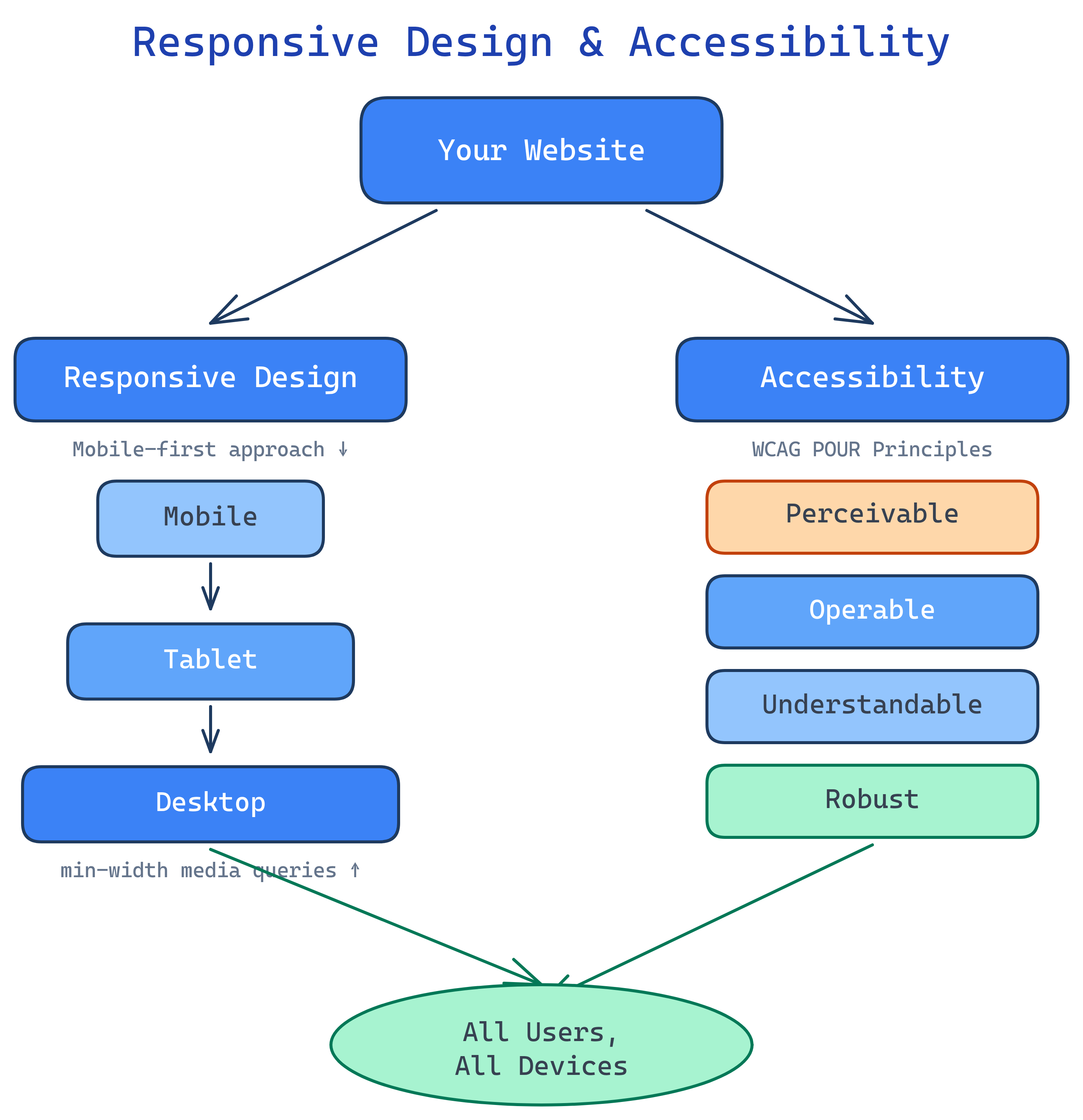
Responsive design makes your site work on any screen size (mobile-first + media queries). Accessibility makes it work for every user (semantic HTML + ARIA + keyboard navigation). Both are non-negotiable for production websites.
The Big Picture
Over 60% of web traffic comes from mobile devices. Around 15% of the world’s population has some form of disability. Responsive design and accessibility aren’t nice-to-haves — they’re the baseline for professional frontend work.
Explain Like I'm 12
Responsive design is like water — it takes the shape of whatever container (screen) you pour it into. A phone gets a single column. A tablet gets two columns. A desktop gets the full layout.
Accessibility is like wheelchair ramps. Buildings have stairs, but ramps let everyone in — people in wheelchairs, parents with strollers, delivery workers with carts. Making websites accessible helps everyone, not just people with disabilities.
Mobile-First Design
Mobile-first means writing your base CSS for small screens first, then adding complexity for larger screens with min-width media queries. This ensures mobile users get a fast, clean experience.
/* Base: mobile styles (no media query needed) */
.container {
  padding: 1rem;
  max-width: 100%;
}

.hero-title {
  font-size: 1.5rem;
}

.nav-links {
  display: none; /* Hidden on mobile — use hamburger menu */
}

/* Tablet: 768px and up */
@media (min-width: 768px) {
  .container {
    padding: 2rem;
    max-width: 768px;
    margin: 0 auto;
  }

  .hero-title {
    font-size: 2.5rem;
  }

  .nav-links {
    display: flex;
    gap: 2rem;
  }
}

/* Desktop: 1024px and up */
@media (min-width: 1024px) {
  .container {
    max-width: 1200px;
  }

  .hero-title {
    font-size: 3.5rem;
  }
}min-width (not max-width) for mobile-first. Common breakpoints: 640px (large phones), 768px (tablets), 1024px (laptops), 1280px (desktops). But design to the content, not to device sizes.
Responsive Images
Images are often the largest assets on a page. Serve the right size for each device to save bandwidth and improve load times.
<!-- Basic responsive image -->
<img src="photo.jpg"
     alt="Team working together"
     loading="lazy"
     style="max-width: 100%; height: auto;">

<!-- Responsive with multiple sizes -->
<img srcset="photo-400w.jpg 400w,
             photo-800w.jpg 800w,
             photo-1200w.jpg 1200w"
     sizes="(max-width: 600px) 400px,
            (max-width: 1000px) 800px,
            1200px"
     src="photo-800w.jpg"
     alt="Team working together"
     loading="lazy">

<!-- Art direction: different crops for different screens -->
<picture>
  <source media="(max-width: 600px)" srcset="photo-portrait.jpg">
  <source media="(max-width: 1000px)" srcset="photo-square.jpg">
  <img src="photo-landscape.jpg" alt="Team working together" loading="lazy">
</picture>loading="lazy" on images below the fold. The browser will defer loading until the image is near the viewport, saving bandwidth and improving initial page load time.
Responsive Typography
Use relative units and clamp() for text that scales smoothly across screen sizes.
/* Fixed sizes — bad (doesn't scale) */
h1 { font-size: 48px; }

/* Relative units — better */
h1 { font-size: 2.5rem; } /* relative to root font size */

/* clamp() — best (fluid scaling with min/max limits) */
h1 {
  font-size: clamp(1.5rem, 4vw, 3.5rem);
  /* minimum: 1.5rem, scales with viewport, maximum: 3.5rem */
}

body {
  font-size: clamp(1rem, 1vw + 0.75rem, 1.25rem);
  line-height: 1.6;
}clamp(min, preferred, max) is the modern way to do fluid typography. No media queries needed. The middle value usually uses vw (viewport width) units so text scales with the screen.
WCAG Accessibility Basics
The Web Content Accessibility Guidelines (WCAG) define four principles (POUR):
| Principle | Meaning | Examples |
|---|---|---|
| Perceivable | Users can perceive the content | Alt text on images, captions on video, sufficient color contrast |
| Operable | Users can navigate and interact | Keyboard navigation, skip links, no time limits |
| Understandable | Content and UI are clear | Clear labels, error messages, consistent navigation |
| Robust | Works with assistive technology | Valid HTML, ARIA attributes, semantic elements |
Semantic HTML for Accessibility
The single most impactful thing you can do for accessibility is use semantic HTML. Screen readers use the HTML structure to navigate.
<!-- Skip link: first focusable element on the page -->
<a href="#main" class="skip-link">Skip to content</a>

<!-- Landmark regions that screen readers announce -->
<header>...</header>  <!-- "Banner" landmark -->
<nav>...</nav>        <!-- "Navigation" landmark -->
<main id="main">      <!-- "Main" landmark -->
  <article>...</article>
</main>
<aside>...</aside>    <!-- "Complementary" landmark -->
<footer>...</footer>  <!-- "Content info" landmark -->

<!-- Headings: create a navigable outline -->
<h1>Page Title</h1>         <!-- One per page -->
  <h2>Section</h2>           <!-- Never skip levels -->
    <h3>Subsection</h3>

<!-- Buttons vs Links -->
<button>Save</button>         <!-- Actions -->
<a href="/about">About</a>   <!-- Navigation -->

<!-- Forms: labels are mandatory -->
<label for="email">Email</label>
<input type="email" id="email" required><div> elements is like a book with no chapter titles — usable but extremely frustrating to navigate.
ARIA Roles & Attributes
ARIA (Accessible Rich Internet Applications) fills accessibility gaps that semantic HTML can’t cover. Use it as a supplement, not a replacement.
<!-- Modal dialog -->
<div role="dialog" aria-labelledby="modal-title" aria-modal="true">
  <h2 id="modal-title">Confirm Action</h2>
  <p>Are you sure you want to delete this item?</p>
  <button>Cancel</button>
  <button>Delete</button>
</div>

<!-- Live region: announces changes to screen readers -->
<div aria-live="polite" id="status"></div>

<!-- Icon button: needs a label -->
<button aria-label="Close menu">
  <svg>...</svg> <!-- X icon -->
</button>

<!-- Expandable section -->
<button aria-expanded="false" aria-controls="details-panel">
  Show Details
</button>
<div id="details-panel" hidden>
  <p>Additional details here...</p>
</div>

<!-- Loading state -->
<div aria-busy="true" aria-live="polite">
  Loading results...
</div><button> is always better than <div role="button">. Native elements have keyboard handling, focus management, and screen reader support built in.
Color Contrast
Low contrast text is unreadable for users with low vision, color blindness, or in bright sunlight.
| WCAG Level | Normal Text | Large Text (18px+ bold / 24px+) |
|---|---|---|
| AA (minimum) | 4.5:1 | 3:1 |
| AAA (enhanced) | 7:1 | 4.5:1 |
/* Good contrast examples */
body {
  color: #1a1a2e;       /* dark text */
  background: #ffffff;   /* white bg — contrast ratio: 16:1 ✅ */
}

/* Don't rely on color alone to convey information */
.error-field {
  border: 2px solid #dc2626;  /* red border */
  /* ALSO add an icon or text — don't rely on color alone */
}
.error-message {
  color: #dc2626;
  /* Prefix with icon: ⚠️ Error: ... */
}Performance Essentials
Performance is part of accessibility — slow sites are unusable on slow connections. These are the key metrics and techniques.
| Core Web Vital | What It Measures | Good Score |
|---|---|---|
| LCP (Largest Contentful Paint) | How fast the main content loads | < 2.5 seconds |
| INP (Interaction to Next Paint) | How fast the page responds to interaction | < 200ms |
| CLS (Cumulative Layout Shift) | How much the layout shifts during load | < 0.1 |
<!-- Prevent CLS: set dimensions on images -->
<img src="hero.jpg" width="1200" height="600" alt="..." loading="lazy">

<!-- Prevent CLS: reserve space for dynamic content -->
<div style="min-height: 60px;">
  <!-- Header loaded via JavaScript -->
</div>

<!-- Preload critical resources -->
<link rel="preload" href="/css/style.css" as="style">
<link rel="preload" href="/fonts/inter.woff2" as="font" type="font/woff2" crossorigin>

<!-- Defer non-critical JavaScript -->
<script src="/js/analytics.js" defer></script>

<!-- Non-blocking font loading -->
<link rel="preload" href="fonts.css" as="style" onload="this.rel='stylesheet'">Test Yourself
What does “mobile-first” mean and why is it preferred over desktop-first?
min-width media queries to add complexity for larger screens. It’s preferred because: (1) mobile users are the majority of web traffic, (2) smaller screens force you to prioritize content, (3) mobile CSS is simpler (fewer columns, simpler layouts), and (4) it’s easier to add complexity than to undo it.What are the four WCAG principles (POUR)?
What is the first rule of ARIA?
<button> instead of <div role="button">, because native elements come with built-in keyboard handling, focus management, and screen reader support.What are Core Web Vitals and why do they matter?
How does clamp() work for responsive typography?
clamp(min, preferred, max) sets a value that scales fluidly between a minimum and maximum. For typography: font-size: clamp(1rem, 2vw + 0.5rem, 2rem) means the font is at least 1rem, scales with viewport width, and caps at 2rem. No media queries needed — the browser handles smooth scaling.Interview Questions
How would you make a website accessible for screen reader users?
What is the difference between srcset and <picture>?
srcset lets the browser choose the best resolution of the same image based on screen size/density. <picture> provides art direction — completely different images for different contexts (e.g., a landscape crop on desktop, portrait crop on mobile). Use srcset for resolution switching, <picture> when the image composition needs to change.What causes Cumulative Layout Shift (CLS) and how do you prevent it?
width/height on images, (2) use font-display: swap with metric-matched fallback fonts, (3) reserve space with min-height for dynamic content, (4) inline critical CSS.