Frontend Development: Core Concepts
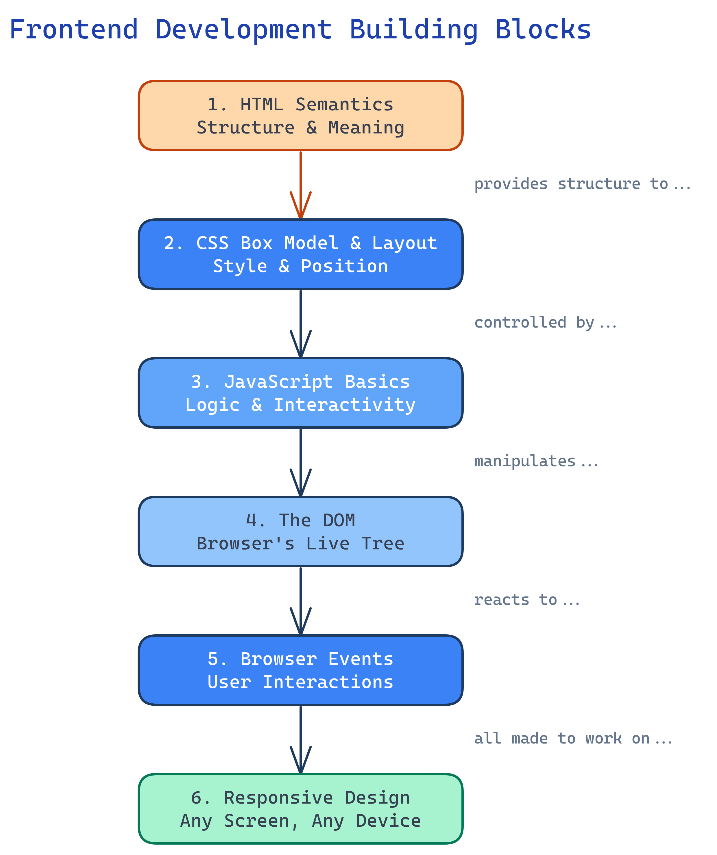
Frontend has 6 building blocks: HTML Semantics, CSS Box Model & Layout, JavaScript Basics, the DOM, Browser Events, and Responsive Design. Master these and you can build any user interface.
The Big Picture
Every frontend feature you build uses some combination of these six concepts. They form a dependency chain: HTML provides the structure that CSS styles, JavaScript manipulates the DOM (which is the browser’s representation of your HTML), events let users interact, and responsive design makes it work on every screen.
Explain Like I'm 12
Think of a video game. HTML is the game world — the map, characters, and items. CSS is the graphics engine — how everything looks. JavaScript is the game logic — what happens when you press buttons. The DOM is the game’s memory — it keeps track of where everything is. Events are the controller inputs — clicks, keypresses, swipes. Responsive design makes the game playable on a TV, laptop, or phone.
Cheat Sheet
| Concept | What It Does | Key Tools |
|---|---|---|
| HTML Semantics | Gives content meaning and structure | <header>, <main>, <article>, <nav> |
| CSS Box Model | Controls spacing, sizing, and layout of every element | margin, padding, border, box-sizing |
| CSS Layout | Arranges elements on the page | Flexbox, Grid, position |
| JavaScript Basics | Adds logic and dynamic behavior | Variables, functions, arrays, objects, fetch |
| The DOM | Browser’s live representation of HTML you can manipulate with JS | querySelector, createElement, textContent |
| Browser Events | React to user interactions | addEventListener, click, submit, keydown |
| Responsive Design | Makes pages work on any screen size | Media queries, rem/em, viewport units |
The 6 Building Blocks
1. HTML Semantics
HTML isn’t just about putting text on a page. Semantic HTML uses elements that describe the meaning of content, not just how it looks. This helps screen readers, search engines, and other developers understand your page.
<!-- Bad: everything is a div -->
<div class="header">
  <div class="nav">...</div>
</div>
<div class="content">
  <div class="article">...</div>
</div>

<!-- Good: semantic elements describe meaning -->
<header>
  <nav>...</nav>
</header>
<main>
  <article>...</article>
</main>2. CSS Box Model & Layout
Every HTML element is a rectangular box. The box model defines how much space it takes up: content + padding + border + margin. Understanding this is essential for layout.
/* The box model */
.card {
  width: 300px;          /* content width */
  padding: 20px;         /* space inside the border */
  border: 1px solid #ccc; /* the border itself */
  margin: 16px;          /* space outside the border */
  box-sizing: border-box; /* width includes padding + border */
}

/* Flexbox: 1D layout (row or column) */
.nav {
  display: flex;
  justify-content: space-between;
  align-items: center;
  gap: 1rem;
}

/* Grid: 2D layout (rows AND columns) */
.card-grid {
  display: grid;
  grid-template-columns: repeat(auto-fill, minmax(280px, 1fr));
  gap: 1.5rem;
}3. JavaScript Basics
JavaScript is the only programming language browsers run natively. It’s what makes web pages interactive — from form validation to single-page apps.
// Variables (use const by default, let when you need to reassign)
const API_URL = 'https://api.example.com/users';
let currentPage = 1;

// Functions
function greet(name) {
  return `Hello, ${name}!`;
}

// Arrow functions (shorter syntax)
const double = (n) => n * 2;

// Arrays and iteration
const fruits = ['apple', 'banana', 'cherry'];
const uppercased = fruits.map(f => f.toUpperCase());
// ['APPLE', 'BANANA', 'CHERRY']

// Objects
const user = {
  name: 'Alice',
  role: 'developer',
  greet() { return `Hi, I'm ${this.name}`; }
};

// Async/await (fetching data from an API)
async function getUsers() {
  const response = await fetch(API_URL);
  const data = await response.json();
  return data;
}var in modern JavaScript. Use const by default and let only when you need to reassign. var has function-scoping quirks that cause bugs.
4. The DOM (Document Object Model)
When the browser loads HTML, it builds a tree structure called the DOM. JavaScript can read and modify this tree, which is how you create dynamic pages.
// Select elements
const heading = document.querySelector('h1');
const allButtons = document.querySelectorAll('.btn');

// Read content
console.log(heading.textContent); // "Hello World"

// Modify content
heading.textContent = 'Updated Title';
heading.style.color = 'blue';

// Create new elements
const card = document.createElement('div');
card.className = 'card';
card.innerHTML = '<h2>New Card</h2><p>Content here</p>';
document.querySelector('.card-grid').appendChild(card);

// Remove elements
const oldBanner = document.querySelector('.banner');
oldBanner.remove();querySelector (returns first match) and querySelectorAll (returns all matches) for selecting elements. They use CSS selector syntax, so if you know CSS, you already know how to use them.
5. Browser Events
Events are how users communicate with your page. Clicks, key presses, form submissions, scrolling — the browser fires events for all of these, and JavaScript can listen and respond.
// Click event
const button = document.querySelector('#submit-btn');
button.addEventListener('click', function(event) {
  console.log('Button clicked!');
});

// Form submission (prevent default page reload)
const form = document.querySelector('#search-form');
form.addEventListener('submit', function(event) {
  event.preventDefault();
  const query = form.querySelector('input').value;
  performSearch(query);
});

// Keyboard events
document.addEventListener('keydown', function(event) {
  if (event.key === 'Escape') {
    closeModal();
  }
});

// Event delegation (efficient for many elements)
document.querySelector('.card-grid').addEventListener('click', function(event) {
  const card = event.target.closest('.card');
  if (card) {
    navigateTo(card.dataset.url);
  }
});addEventListener in JavaScript. Never use inline onclick HTML attributes — they mix HTML and JS, are harder to debug, and only allow one handler per event.
6. Responsive Design
Responsive design makes your pages work on any screen size — from a 4-inch phone to a 32-inch monitor. The key tools are media queries, relative units, and flexible layouts.
/* Mobile-first approach: base styles for small screens */
.container {
  padding: 1rem;
  max-width: 100%;
}

.card-grid {
  display: grid;
  grid-template-columns: 1fr; /* 1 column on mobile */
  gap: 1rem;
}

/* Tablet (768px and up) */
@media (min-width: 768px) {
  .card-grid {
    grid-template-columns: repeat(2, 1fr); /* 2 columns */
  }
}

/* Desktop (1024px and up) */
@media (min-width: 1024px) {
  .container {
    max-width: 1200px;
    margin: 0 auto;
  }
  .card-grid {
    grid-template-columns: repeat(3, 1fr); /* 3 columns */
  }
}min-width media queries. This gives mobile users faster load times and cleaner code.
Test Yourself
What is the CSS box model and what are its four parts?
box-sizing: border-box so width includes padding and border.What is the DOM and why does JavaScript need it?
querySelector, createElement, and textContent all work through the DOM.When should you use Flexbox vs CSS Grid?
Why should you use semantic HTML elements instead of divs for everything?
<header>, <nav>, <main>, <article>) describe the meaning of content, not just its appearance. This helps: (1) screen readers navigate the page, (2) search engines understand your content for SEO, (3) developers read and maintain the code, and (4) browser built-in features like Reader Mode work correctly.What does “mobile-first” mean in responsive design?
min-width media queries. This ensures mobile users (the majority of web traffic) get a clean experience with only the CSS they need, while desktop users get enhanced layouts progressively.