HTML & CSS Fundamentals
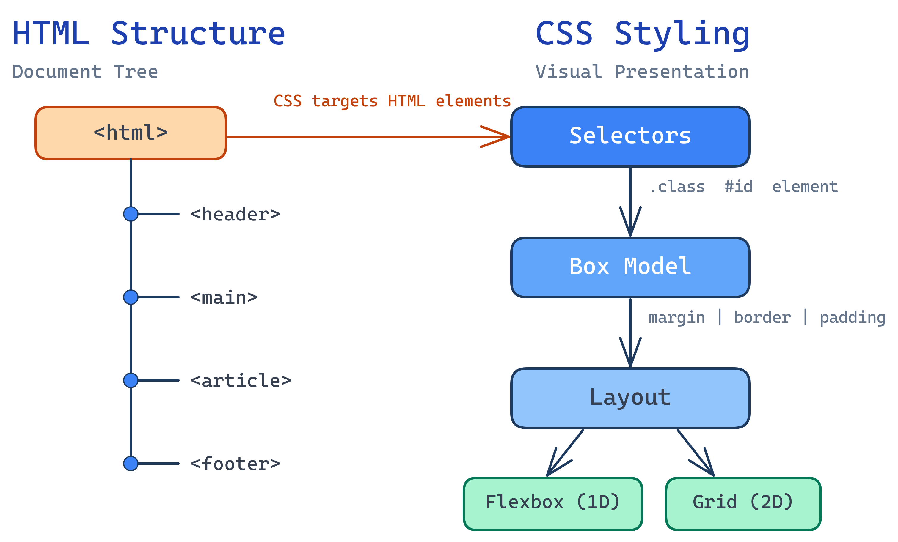
HTML provides semantic structure (<header>, <main>, <article>). CSS controls presentation through selectors, the box model, and layout systems (Flexbox for 1D, Grid for 2D). Master specificity, and you’ll never fight CSS again.
The Big Picture
HTML and CSS are inseparable partners. HTML provides the bones — the semantic structure that gives meaning to content. CSS provides the skin — colors, fonts, spacing, and layout. Together, they produce every visual element you see on the web.
Explain Like I'm 12
HTML is like writing a school essay with headings, paragraphs, and bullet points. It tells the reader what things are. CSS is like formatting that essay — choosing fonts, adding colors, deciding where images go. The essay content (HTML) stays the same even if you change the formatting (CSS) completely.
Semantic HTML
Semantic elements describe their content. Instead of using <div> for everything, use elements that tell browsers, screen readers, and search engines what role each section plays.
<!-- Page structure with semantic elements -->
<body>
<header>
<nav aria-label="Main navigation">
<ul>
<li><a href="/">Home</a></li>
<li><a href="/about">About</a></li>
</ul>
</nav>
</header>
<main>
<article>
<h1>Article Title</h1>
<p>Article content...</p>
<section id="key-points">
<h2>Key Points</h2>
<ul>
<li>Point one</li>
<li>Point two</li>
</ul>
</section>
<aside>
<p>Related sidebar content</p>
</aside>
</article>
</main>
<footer>
<p>© 2026 My Site</p>
</footer>
</body>| Element | Purpose | Use When |
|---|---|---|
<header> | Introductory content or navigation | Page header, article header |
<nav> | Navigation links | Main nav, sidebar nav, breadcrumbs |
<main> | Primary content (one per page) | The main content area |
<article> | Self-contained content | Blog post, news article, product card |
<section> | Thematic grouping with heading | Chapter, tab panel, topic group |
<aside> | Tangentially related content | Sidebar, callout, pull quote |
<footer> | Footer content | Copyright, links, contact info |
<section> should always have a heading. If you just need a container for CSS, use a <div>.
HTML Forms
Forms are how users send data to your app. Use the right input types for built-in validation and mobile keyboard optimization.
<form id="signup-form" action="/api/signup" method="POST">
  <label for="email">Email</label>
  <input type="email" id="email" name="email" required
         placeholder="[email protected]">

  <label for="password">Password</label>
  <input type="password" id="password" name="password"
         required minlength="8">

  <label for="dob">Date of Birth</label>
  <input type="date" id="dob" name="dob">

  <label for="plan">Plan</label>
  <select id="plan" name="plan">
    <option value="free">Free</option>
    <option value="pro">Pro</option>
  </select>

  <button type="submit">Sign Up</button>
</form><label> elements with a matching for attribute. This makes forms accessible and increases the clickable area on mobile.
CSS Selectors & Specificity
Selectors target HTML elements to apply styles. When multiple rules target the same element, specificity determines which one wins.
/* Element selector (specificity: 0-0-1) */
p { color: black; }

/* Class selector (specificity: 0-1-0) */
.highlight { color: blue; }

/* ID selector (specificity: 1-0-0) */
#main-title { color: red; }

/* Combined selectors add up */
article.featured p { color: green; }  /* 0-1-2 */

/* Pseudo-classes */
a:hover { text-decoration: underline; }
li:first-child { font-weight: bold; }
input:focus { outline: 2px solid #4f46e5; }

/* Pseudo-elements */
p::first-line { font-weight: bold; }
.quote::before { content: '\201C'; /* left double quote */ }

/* Attribute selectors */
input[type="email"] { border-color: blue; }
a[href^="https"] { color: green; } /* starts with https */| Selector Type | Example | Specificity |
|---|---|---|
| Element | p, div, h1 | 0-0-1 |
| Class | .card, .active | 0-1-0 |
| ID | #header | 1-0-0 |
| Inline style | style="..." | 1-0-0-0 |
!important | Overrides everything | Avoid using |
!important and ID selectors for styling. They make CSS hard to override. Stick to class selectors — they’re specific enough and easy to manage.
The Box Model
Every element in CSS is a box. The box model determines its total size:
/* Without border-box: total width = 300 + 40 + 2 = 342px */
.card {
  width: 300px;
  padding: 20px;
  border: 1px solid #ccc;
}

/* With border-box: total width = 300px (padding & border included) */
.card {
  width: 300px;
  padding: 20px;
  border: 1px solid #ccc;
  box-sizing: border-box; /* This is what you want */
}

/* Best practice: apply border-box globally */
*, *::before, *::after {
  box-sizing: border-box;
}

/* Margin collapse: two 20px margins don't make 40px — they collapse to 20px */
.section { margin-bottom: 20px; }
.section + .section { margin-top: 20px; }
/* Gap between sections = 20px, not 40px */Flexbox
Flexbox is a one-dimensional layout system — it arranges items in a row or column. Perfect for navigation bars, card rows, and centering content.
/* Center anything vertically and horizontally */
.centered {
  display: flex;
  justify-content: center;  /* horizontal centering */
  align-items: center;       /* vertical centering */
  min-height: 100vh;
}

/* Navigation bar */
.navbar {
  display: flex;
  justify-content: space-between;
  align-items: center;
  padding: 1rem 2rem;
}

/* Card row that wraps */
.card-row {
  display: flex;
  flex-wrap: wrap;
  gap: 1rem;
}
.card-row .card {
  flex: 1 1 280px; /* grow, shrink, minimum 280px */
}

/* Sticky footer layout */
body {
  display: flex;
  flex-direction: column;
  min-height: 100vh;
}
main { flex: 1; } /* main area takes all available space */gap property works in both Flexbox and Grid. It’s much cleaner than using margins for spacing between items.
CSS Grid
Grid is a two-dimensional layout system — it handles rows AND columns simultaneously. Perfect for page layouts, dashboards, and complex card grids.
/* Responsive card grid (no media queries needed!) */
.card-grid {
  display: grid;
  grid-template-columns: repeat(auto-fill, minmax(280px, 1fr));
  gap: 1.5rem;
}

/* Classic page layout */
.page-layout {
  display: grid;
  grid-template-columns: 250px 1fr 200px;  /* sidebar | main | toc */
  grid-template-rows: auto 1fr auto;        /* header | content | footer */
  gap: 2rem;
  min-height: 100vh;
}

/* Named grid areas (very readable) */
.dashboard {
  display: grid;
  grid-template-areas:
    "header header header"
    "sidebar main aside"
    "footer footer footer";
  grid-template-columns: 200px 1fr 200px;
  grid-template-rows: auto 1fr auto;
}
.dashboard header { grid-area: header; }
.dashboard .sidebar { grid-area: sidebar; }
.dashboard main { grid-area: main; }
.dashboard aside { grid-area: aside; }
.dashboard footer { grid-area: footer; }repeat(auto-fill, minmax(280px, 1fr)) is the magic formula for responsive grids. It creates as many columns as fit, each at least 280px wide, stretching equally to fill the space — no media queries needed.
CSS Custom Properties (Variables)
Custom properties let you define reusable values. They cascade like any CSS property and can be changed dynamically with JavaScript.
/* Define variables on :root for global access */
:root {
  --color-primary: #4f46e5;
  --color-text: #1a1a2e;
  --color-bg: #ffffff;
  --font-body: 'Inter', sans-serif;
  --space-4: 1rem;
  --radius: 8px;
}

/* Dark mode: just swap the values */
[data-theme="dark"] {
  --color-text: #e2e8f0;
  --color-bg: #0f172a;
}

/* Use variables throughout your CSS */
body {
  font-family: var(--font-body);
  color: var(--color-text);
  background: var(--color-bg);
}

.btn-primary {
  background: var(--color-primary);
  padding: var(--space-4);
  border-radius: var(--radius);
}:root, override them in [data-theme="dark"], and every element updates automatically.
Test Yourself
What is CSS specificity and how is it calculated?
#nav .item a = 1-1-1. Higher scores win. Inline styles beat everything except !important. When specificity ties, the rule that appears last in the CSS wins.What does box-sizing: border-box do and why is it important?
content-box), width only includes the content area — padding and border are added on top, making elements wider than expected. border-box makes width include padding and border, so a 300px element is always 300px total. It’s universally applied with *, *::before, *::after { box-sizing: border-box; }.Write the CSS to create a responsive grid that auto-fills with cards at least 250px wide.
.grid {
  display: grid;
  grid-template-columns: repeat(auto-fill, minmax(250px, 1fr));
  gap: 1rem;
}
auto-fill creates as many columns as fit. minmax(250px, 1fr) ensures each column is at least 250px and stretches equally to fill remaining space.What is margin collapse and when does it happen?
What are CSS custom properties and how do they differ from Sass variables?
--color: blue, used with var(--color)) are native to the browser and work at runtime. They cascade, can be overridden per selector, and can be changed with JavaScript. Sass variables ($color: blue) are compile-time only — they’re replaced with values when Sass compiles to CSS and don’t exist in the browser.Interview Questions
Explain the difference between display: none, visibility: hidden, and opacity: 0.
display: none removes the element from the layout entirely (no space taken, not accessible). visibility: hidden hides the element but it still takes up space in the layout. opacity: 0 makes the element transparent but it still takes space AND is still interactive (clickable). For accessibility, display: none and visibility: hidden hide from screen readers; opacity: 0 does not.What is the difference between em and rem units?
em is relative to the parent element’s font size, which compounds (nesting 1.2em three levels deep = 1.728x). rem is relative to the root (<html>) font size, which is predictable regardless of nesting. Use rem for consistent sizing and em only when you want sizes to scale with the parent.How would you center a <div> both vertically and horizontally?
display: flex; justify-content: center; align-items: center; on the parent. Alternative with Grid: display: grid; place-items: center; (one-line centering). The parent needs a defined height (e.g., min-height: 100vh).